Building the Owner’s Manual for the BMC Kaius Generation 2

Creating an owner’s manual is often underestimated. It sits at the intersection of engineering, product, and user experience, and when done right, it becomes a key part of how riders understand and trust a product.

For the BMC Kaius Generation 2, the objective was clear: deliver a manual that is technically accurate, visually intuitive, and aligned with the premium positioning of the bike.

Defining the Structure from a Product Perspective

The foundation of the manual started with structure.

Rather than relying on legacy formats, I built the framework from scratch based on my technical background and experience in product management. The goal was to mirror how a rider actually interacts with the bike, from first setup to advanced adjustments and maintenance.

This led to a clear, logical flow:

  • Introduction
  • Safety guidelines
  • Product overview
  • Adjustments and torque specs
  • Assembly steps including key systems (cockpit, drivetrain, braking, integration)
  • Maintenance guidelines

Each section was designed to reduce friction: short, focused, and action-oriented.

The famous exploded view with dynamic links to each component.

Writing the Copy: Precision Over Volume

The copy was developed with a simple principle: clarity beats completeness.

Instead of overloading the manual with information, the focus was on delivering the right information at the right moment. This meant:

  • Creating clear illustrations
    • Using concise, directive language
  • Avoiding unnecessary technical jargon where possible
  • Highlighting critical actions (torque, safety points, tips)
  • Ensuring consistency across all sections

At the same time, the technical depth remained intact—especially for key components and adjustments where precision matters.

Chain guide section explaining the different configurations possible.

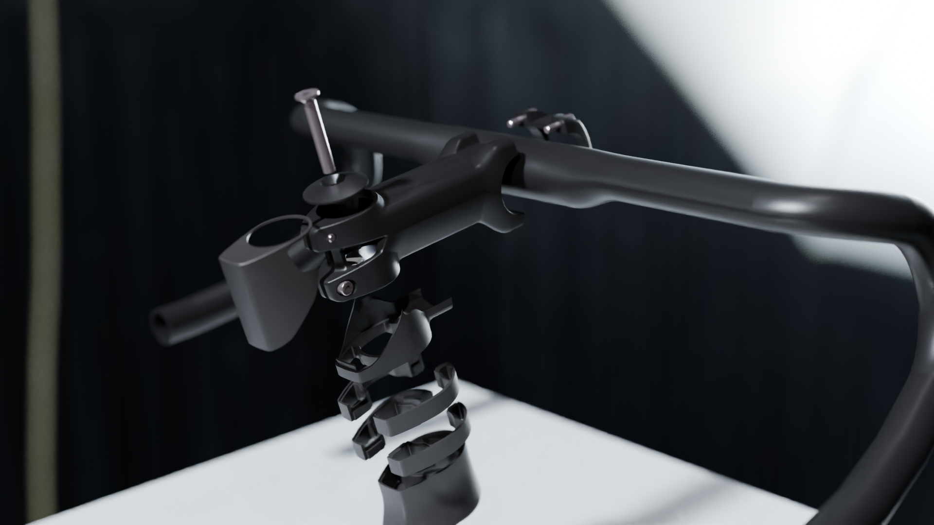
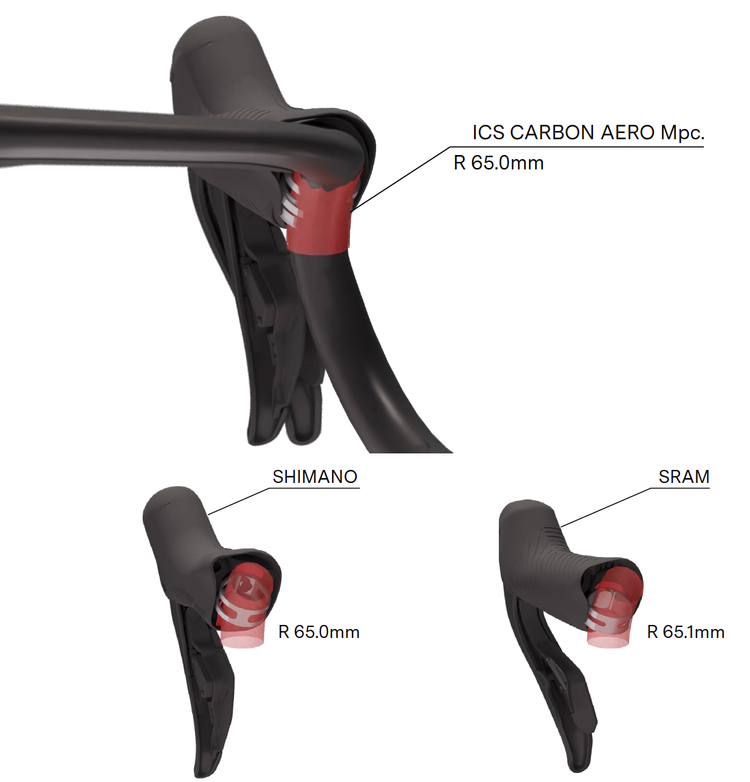
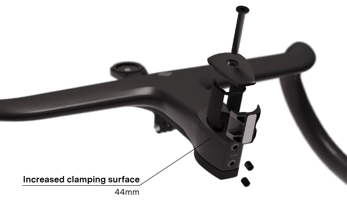
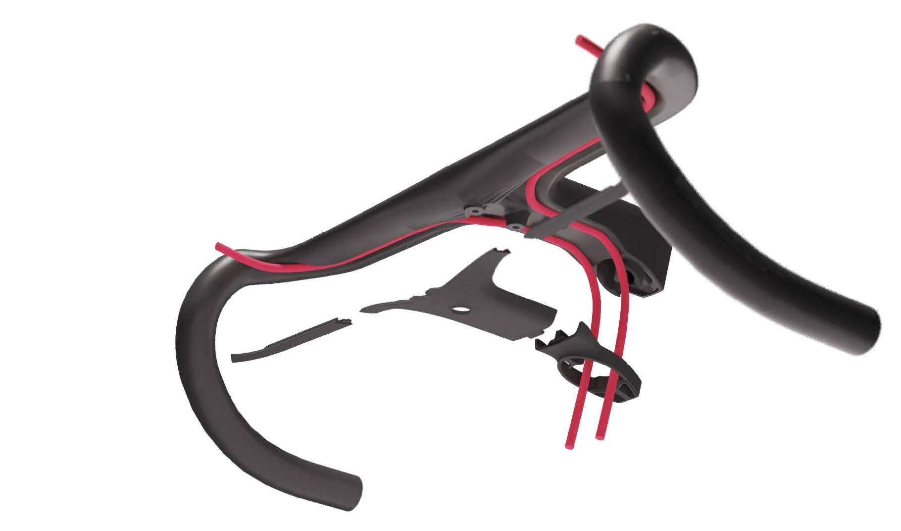
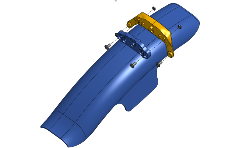
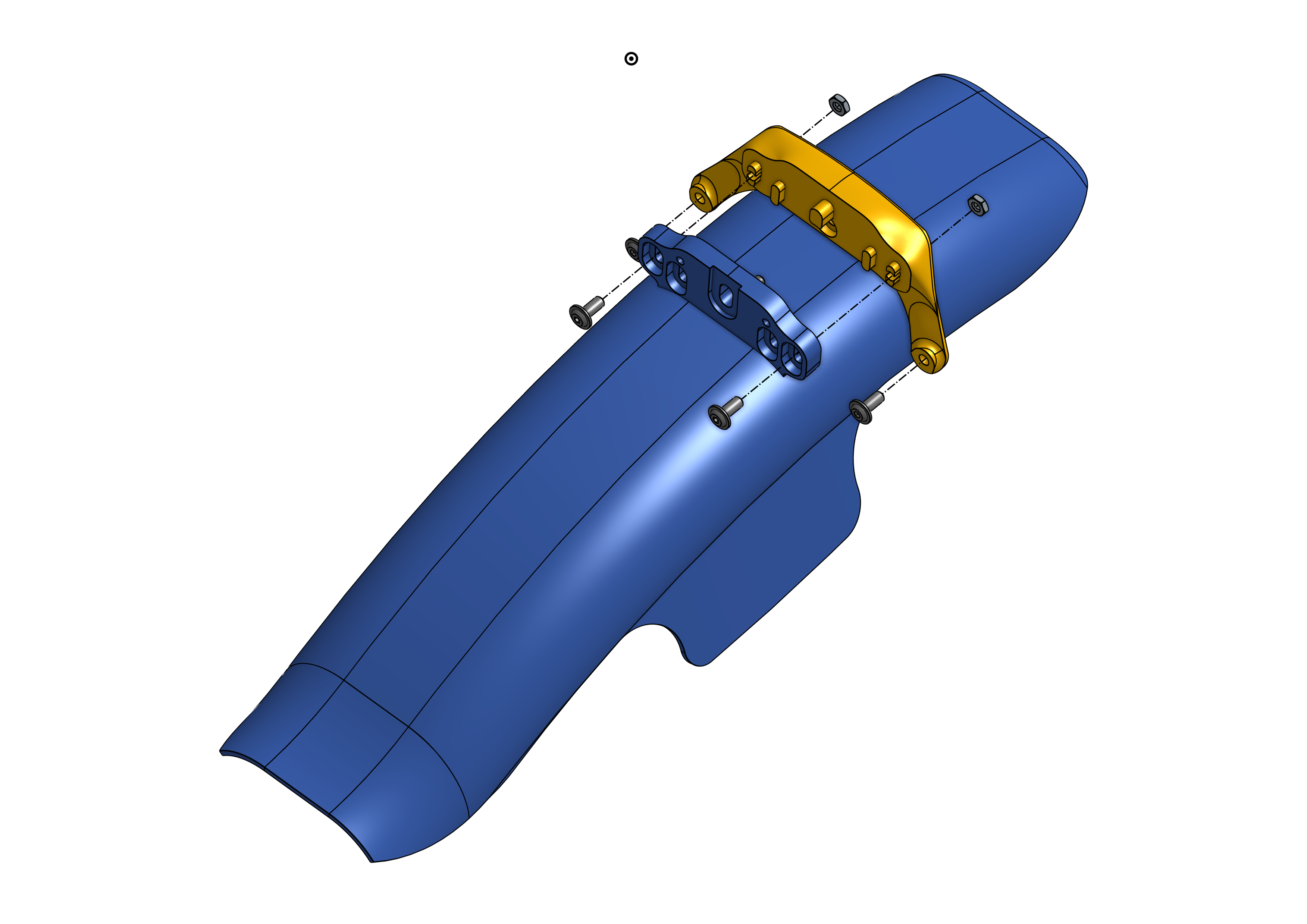
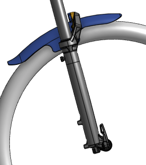
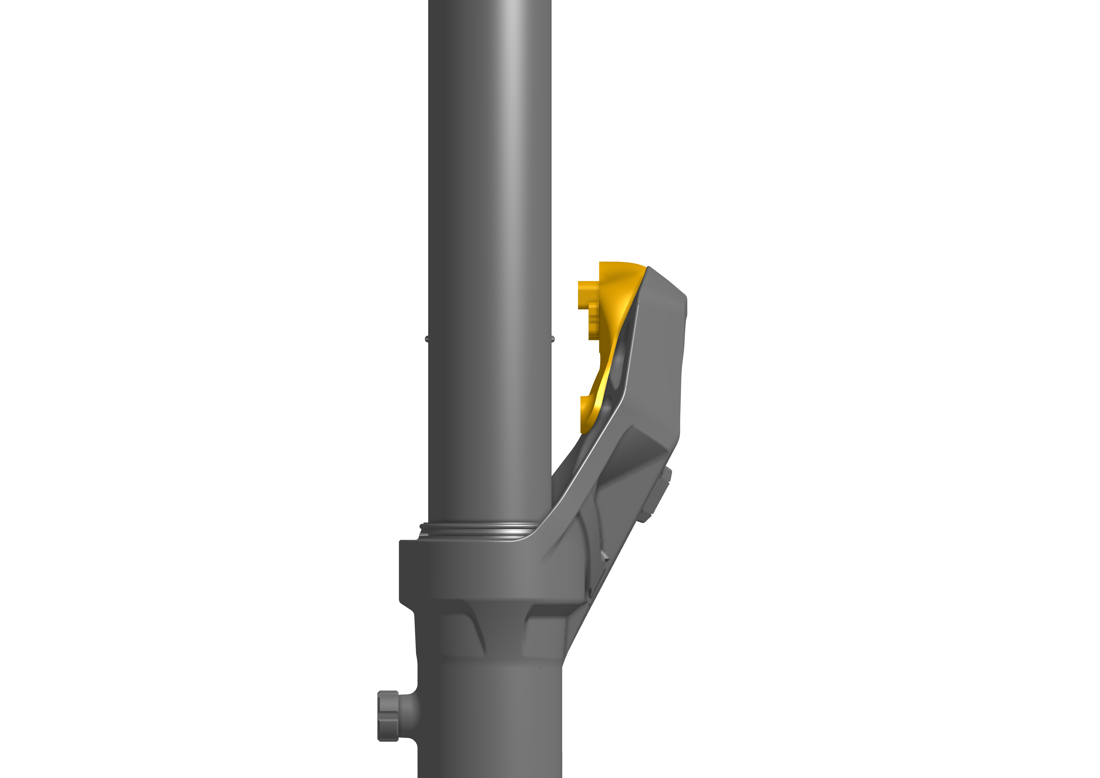
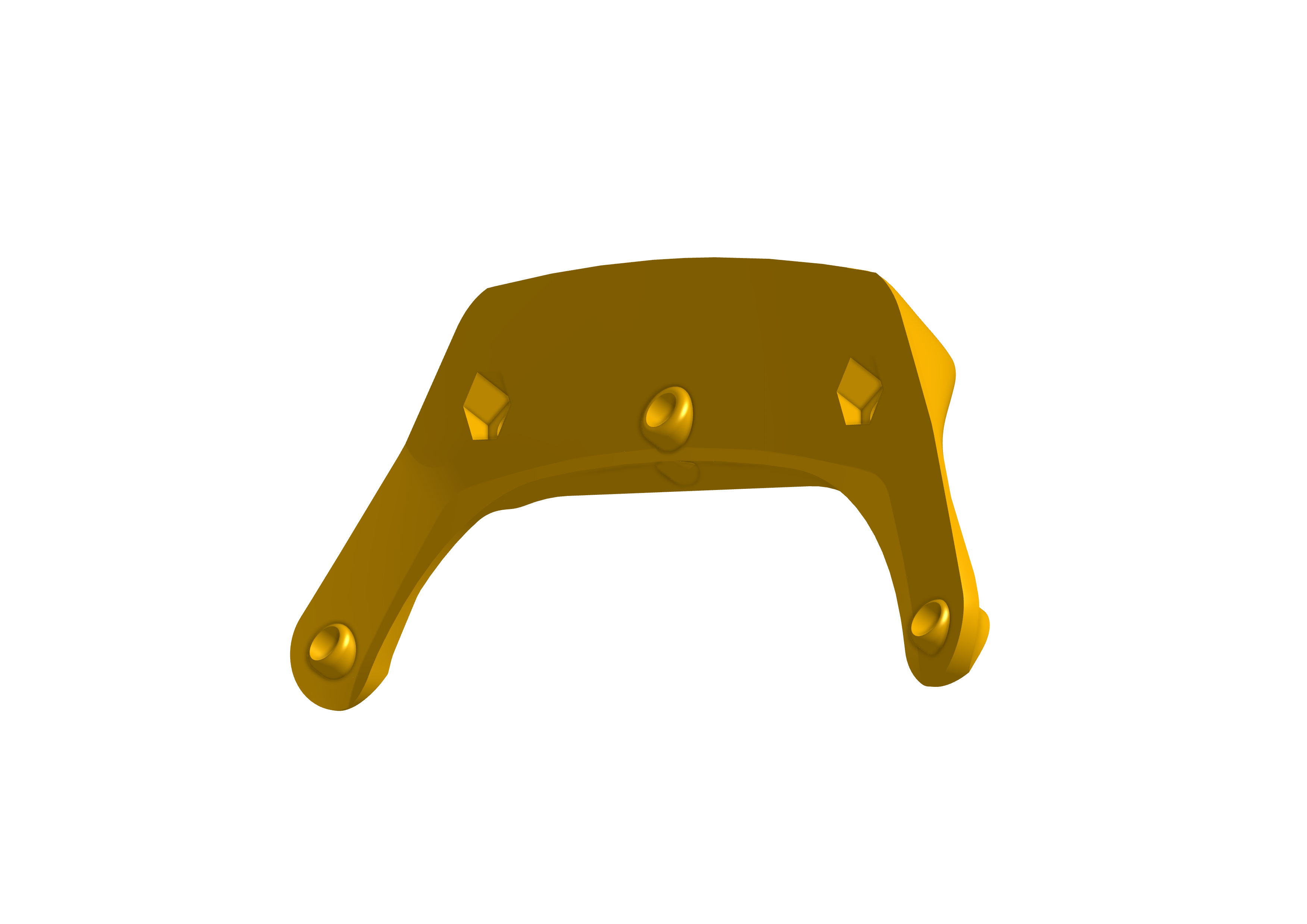
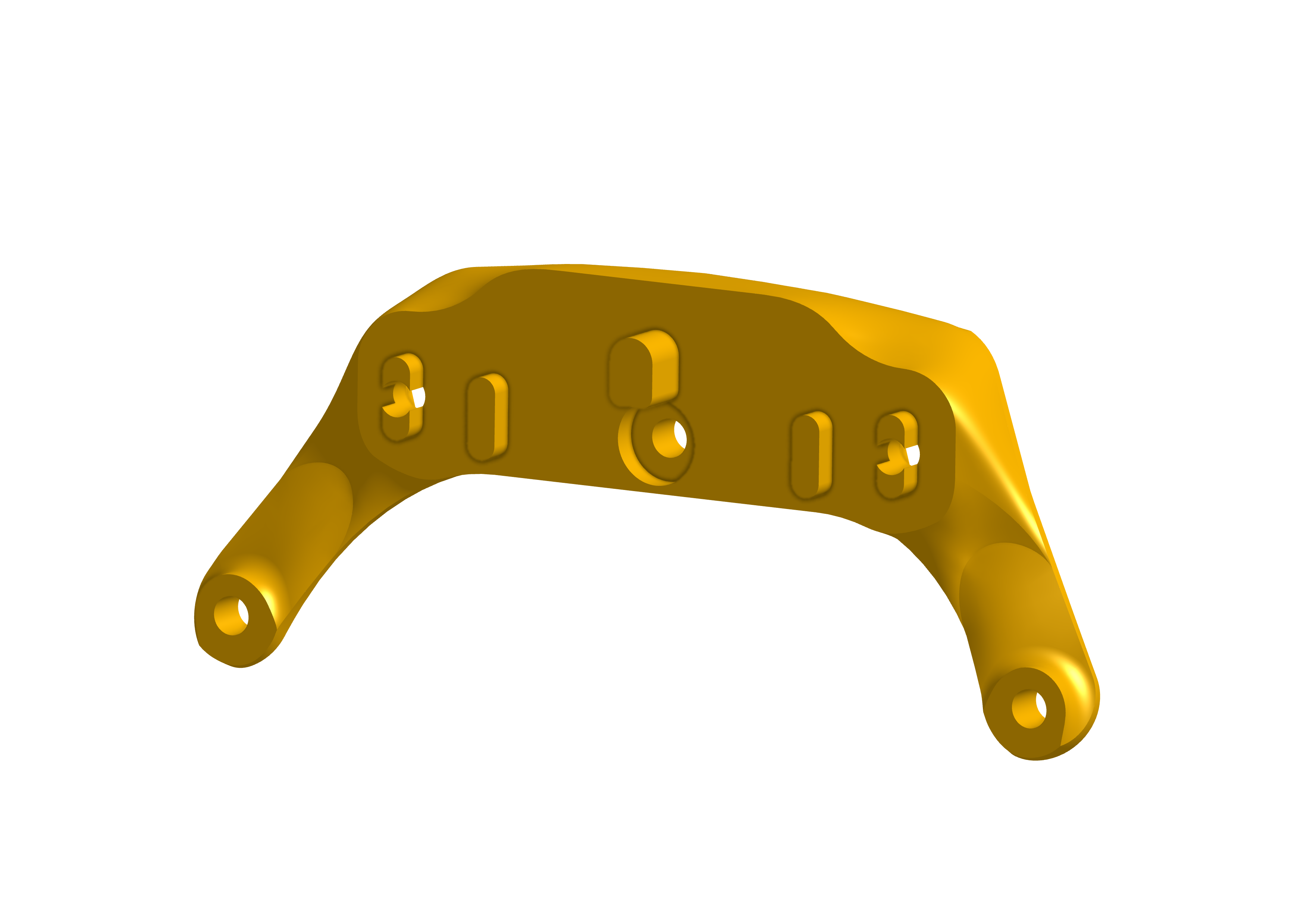
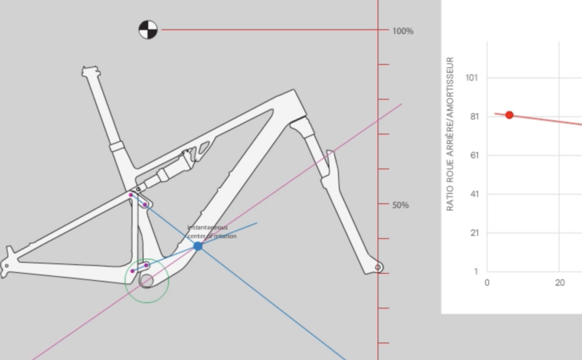
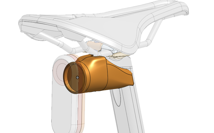
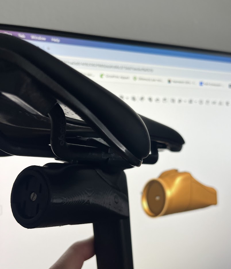
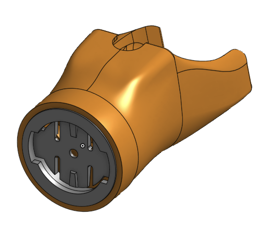
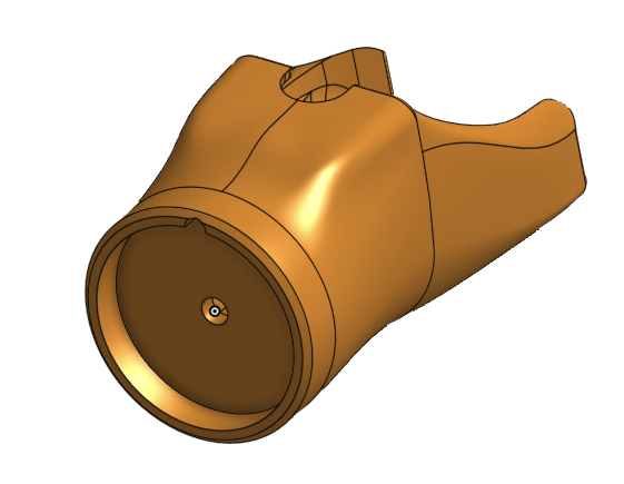
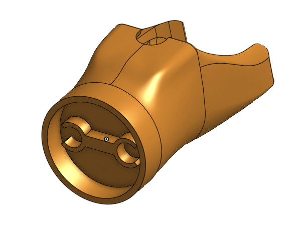
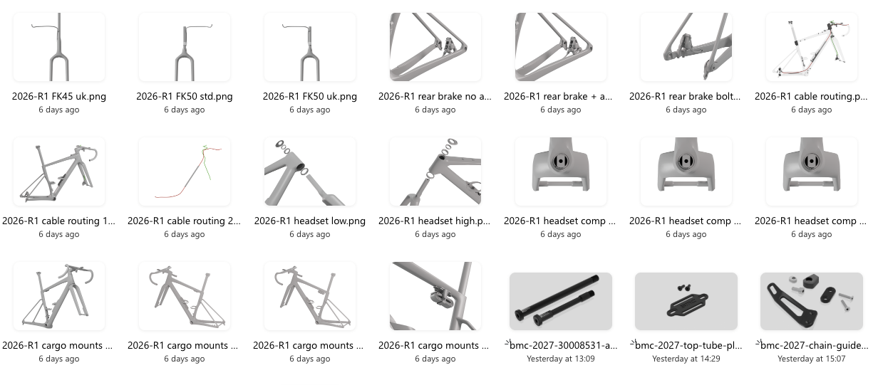
Creating Imagery with R&D 3D Data

A major step forward in this project was the use of 3D assets directly from R&D.

By leveraging native CAD data and rendering it in Blender, I was able to create:

  • Clean, distraction-free visuals
  • Perfectly accurate component representations
  • Consistent angles and lighting across all images

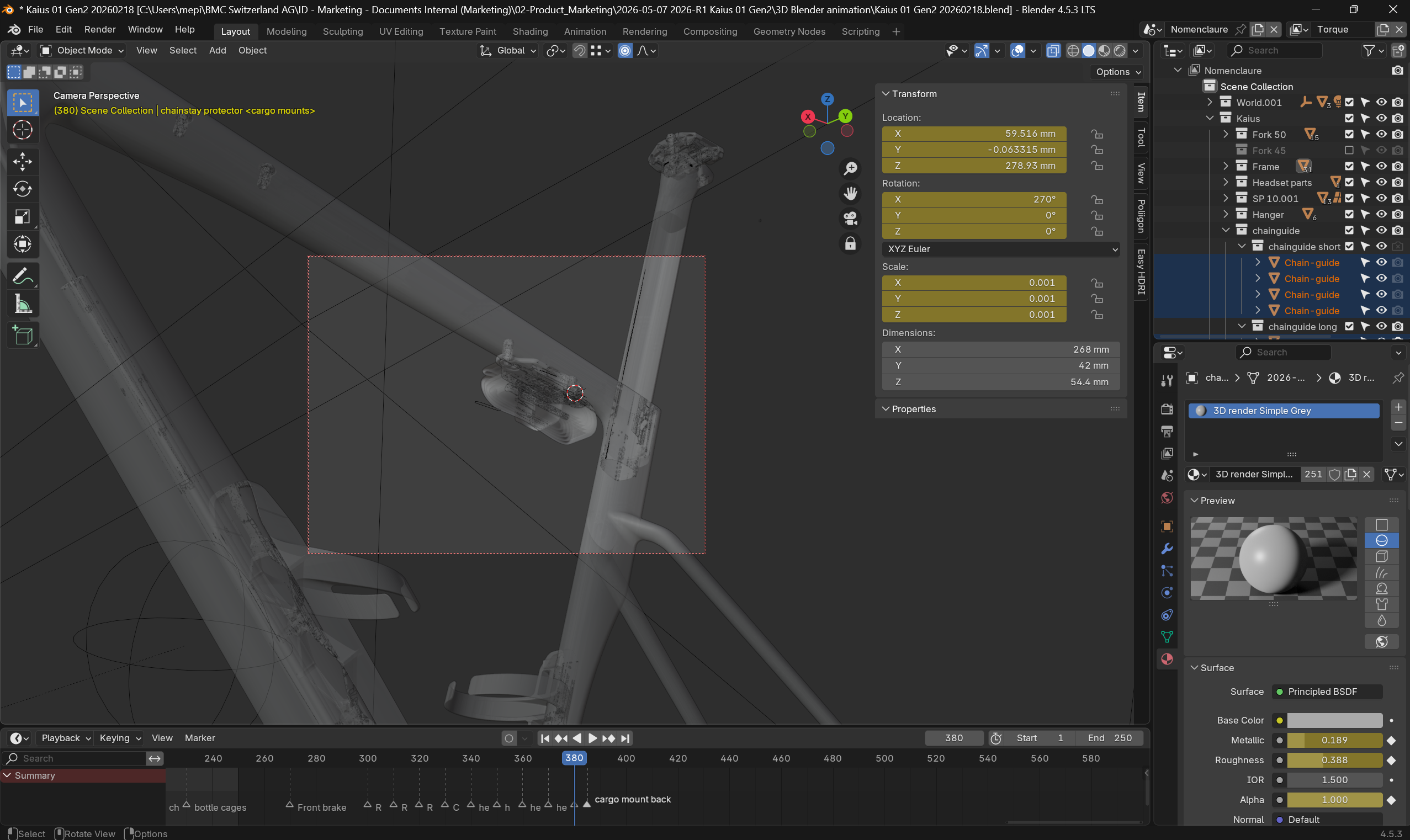
This approach solved a common issue with traditional manuals: photography limitations. Instead of dealing with physical prototypes, lighting constraints, or inconsistencies, the 3D workflow ensured full control and scalability.

It also allowed us to illustrate complex internal features and assemblies that would be difficult or impossible to capture with a camera.

Some of the imagery prepared with Blender.

Cross-Functional Collaboration

While the structure and core content were driven autonomously, the manual was ultimately a collaborative effort.

Close coordination was required across multiple teams:

  • R&D for technical validation and 3D assets
  • Quality for compliance, safety checks, and accuracy
  • Product Management for product definition
  • Marketing for tone, branding, and visual alignment

The challenge was not just gathering input, but organizing it efficiently. Clear ownership and structured reviews were key to keeping the process moving and avoiding unnecessary iterations.

From Draft to Approval

The final phase focused on alignment and validation.

Each section went through targeted reviews with the relevant stakeholders, ensuring that:

  • Technical information was fully validated
  • Safety-critical instructions were clearly highlighted
  • Visuals matched the latest product specifications
  • The overall document remained consistent and coherent

The result is a manual that reflects the product itself: precise, refined, and built with intent.

Key Takeaways

  • A strong structure is the backbone of any effective manual
  • Clarity and usability should drive copywriting decisions
  • 3D-based imagery significantly improves consistency and quality
  • Cross-functional collaboration is essential—but needs structure
  • Ownership and autonomy help maintain speed and coherence

This project is a good example of how technical documentation, when approached as a product in itself, can elevate the overall user experience.
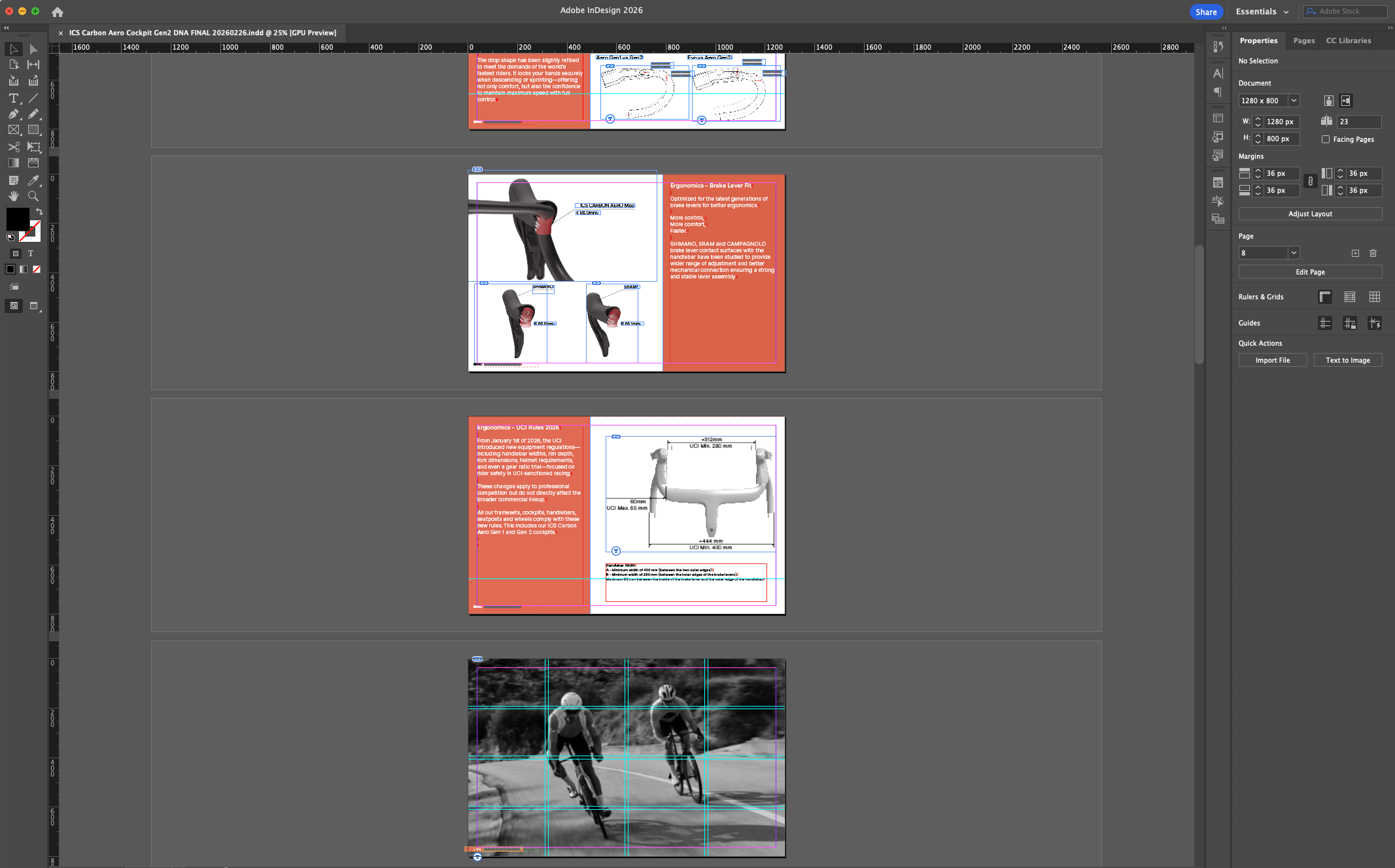
The final document:

From Idea to Integration: The Creation of ICS Eco at BMC

When I joined BMC Switzerland in 2022, the brand’s integrated cockpit technology was already well established. However, it came with a limitation: fully integrated cable routing was only available on bikes starting at around €7000.

The reason was simple. The only compatible stem used for internal cable routing was the ICS2 stem system, a high-end solution whose cost made it difficult to specify on more accessible models. As a result, integrated cable routing remained restricted to the top of the range.

The high end ICS2 stem.

Together with Angelo Lecchi, also Senior Product Manager, we pushed internally to explore alternatives. We asked the R&D team to develop a more affordable solution that could bring integrated cable routing to a wider range of bikes.

An initial idea emerged: creating a more economical version of the ICS2 stem. Unfortunately, even this approach remained too expensive to reach the desired product segments.

So during the long weekend of May 1st, 2022, I started working on the problem myself.

The « Core » Idea

The concept was straightforward: use the existing BMC RSM01 stem, whose cost structure was ideal, and combine it with the ICS2 ecosystem so that existing top cones and spacers could still be used.

What was missing was the interface between the two systems: the ICS spacers and the stem.

This interface quickly became known as ICS Eco.

The BMC RSM01 stem.

Version 1 – Making It Work

The first version guided the cables under the stem while using the same upper volumes as the ICS2 system. To close the back of the stem, a cover was added behind it.

To ensure proper fixation on the fork steerer, the design reused the ICS2 stem’s wedges that press against the sides of the flat steerer tube.

The V1 concept worked, but it was visually quite large.

Initial concept mimics ICS 2 stem.

Version 2 – Reducing the Volume

About a week later, a second version appeared. The goal was to reduce the size of the rear section by finishing the RSM01 stem with a smaller appendix. This improved the proportions and reduced the visual mass.

Version 2 with the back appendix.

Version 3 – Simplifying

The third version followed immediately. It aimed to simplify the design by removing the appendix entirely. While technically simpler, the result was visually less appealing and still lacked the ICS wedges.

It was clear that the concept needed further refinement.

Version 3 with minimalist design.

Collaboration and Refinement

At this stage, I began a close and very enjoyable collaboration with Etienne Goy, the engineer responsible for the project. Together we refined the concept and worked through the technical constraints to find the right balance between cost, integration, and aesthetics.

One of the many 3D printed prototype. Here with the V4 design.

Version 4 – The Final Concept

In December 2022, the fourth version finally gave the project its definitive direction.

This iteration:

  • Integrated the ICS wedges to press securely on the sides of the fork steerer
  • Allowed the addition of a clip-on finishing cover for the rear of the RSM01 stem
  • Preserved compatibility with the existing ICS2 spacer and top cone ecosystem

The result was a clean, efficient, and cost-optimized interface.

Version 4 featuring the final shapes and elements.

From Prototype to Production

With the concept validated, the project entered full development. The first production parts arrived shortly afterward and began appearing on many models of the 2024 range.

ICS Eco ultimately achieved its objective: bringing the visual cleanliness and functional benefits of integrated cable routing to bikes at retail price starting from €2500.

A Project I’m Proud Of

From the initial need to a working prototype and finally to a production solution perfectly aligned with cost targets, ICS Eco represents the type of project I value most.

It started with a simple observation, evolved through rapid iterations, and succeeded thanks to strong collaboration between product management and engineering.

And for me personally, it remains a project I’m particularly proud of.

The MY27 Teammachine SLR ONE with the ICS Eco and RSM01 stem.

Product Marketing on BMC ICS Carbon Aero Cockpit Gen 2

As Product Marketing Manager, my role focused on collecting performance data, technical insights, and design intentions, then translating them into visuals and messaging that retailers, media, and riders could easily understand and connect with.

Like many performance-driven projects, the cockpit evolved through multiple inputs coming from engineering priorities, rider feedback, testing, and design iterations. Transforming all these elements into a coherent and engaging product story became one of the most interesting parts of the process.

A special thanks goes to Etienne Goy for the quality of his work and support throughout the project. His technical input and collaboration helped elevate the final result and bring clarity to many aspects of the development.

At the end of the day, product storytelling always requires finding the right balance between technical reality and emotional appeal. The objective is not to exaggerate performance claims, but to present the product in a way that highlights its strengths and helps riders understand where its value truly sits.

Building the Product Story and DNA Document.

Once the story structure and positioning were defined, the copywriting phase started with a first draft built around the available data, technical facts, and product intentions.

The text was then refined and polished together with Jonathan Camp whose work helped bring more rhythm, clarity, and consistency to the final messaging.

The document layout was created in Adobe InDesign before being handed over to Fritjog Hilgenfeldt. for final visual execution. Through strong photography, refined product imagery, and consistent BMC branding, the project evolved into a polished and visually compelling presentation.

The storytelling for this project had to be built once the product definition was already largely established. While not always ideal from a marketing perspective, it also represents where product marketing can bring the most value: identifying the product strengths, structuring the narrative, and connecting technical development with rider expectations.

The resulting story was built around the areas riders are most likely to value when evaluating a high-performance cockpit: stiffness, integration, aerodynamics, ergonomics, and overall riding feel.

Rather than focusing purely on aerodynamic claims — already heavily used throughout the industry — the communication strategy aimed to create a broader and more differentiated product narrative.

To organize the presentation of the cockpit’s features and development priorities, the story was segmented into three main themes: Ergonomics, Yin & Yang (weight-to-stiffness), AeroSynthesis.

These sections helped structure both the technical explanations and the visual storytelling throughout the Product DNA document.

Ergonomics quickly became one of the strongest and most tangible elements of the project.

To explain the cockpit’s shaping, rider positioning, and transition surfaces, I created a series of 3D renderings and technical illustrations highlighting each section of the design. Animated 3D sequences also became essential tools for live product presentations to retailers, media, and riders.

Still frames extracted from these animations were later integrated into the static “Product DNA” PDF document to support the storytelling with clear visual references.

The Yin & Yang section originally started almost humorously as a way to present the product’s performance trade-offs in a more engaging format.

The new cockpit prioritizes front-end stiffness and steering precision, resulting in a significantly stiffer structure compared to the previous generation. Rather than focusing purely on weight figures, the communication centered on explaining the engineering decisions and structural changes that enabled these performance gains.

To support this section, dedicated 3D animations and renderings were created to visualize updated clamping solutions and structural design evolutions that contributed to the increased stiffness.

Aerodynamics naturally remained an important part of the project.

Interestingly, positioning the aerodynamic story slightly later in the presentation was a deliberate choice. In a market where nearly every one-piece cockpit communicates “aero-first,” shifting the focus toward rider experience and control helped create a more differentiated narrative.

For this section, simplified CFD screenshots and airflow illustrations from the R&D process were integrated into the storytelling. Even relatively simple aerodynamic visuals proved highly effective in communicating the product’s intent and reinforcing its visual identity.

The complete project documentation is available below:

Product DNA

Owner’s manual

The development of the BMC ICS Carbon Aero Gen 2 Marketingf Campaign assets was ultimately much more than the creation of a new cockpit. It became an exercise in transforming engineering decisions, rider feedback, industrial design, and performance targets into a coherent product experience and story.

From technical visualization and copywriting to product positioning and final presentation assets, the project highlighted the importance of connecting complex development work with clear and engaging communication. Bringing structure, clarity, and value to technically driven projects remains one of the aspects of product marketing I enjoy most.

Protect Your Investment: Cutting Profiles for SRAM Red D1 and E1 Crank Arm Protectors

If you own a set of SRAM Red D1 or E1 generation crank arms, you know they are both beautiful and a significant investment. Over time, road grit, chain drops, and accidental scrapes can leave them looking pretty beat up—something I’ve learned the hard way with my older sets!

To combat this wear and tear and keep your high-end components looking pristine, I decided to develop a simple, effective solution: a custom-cutting profile for transparent adhesive protection film.

Protect it before it’s too late …

The Quick DIY Protection Solution

The process was surprisingly fast and yielded great results. Here’s what I did:

  1. Design the Profile: I defined a simple profile shape designed to cover the main surfaces of the crank arm.
  2. Print to Scale: Using my trusty little Epson inkjet printer, I printed the profile to the exact scale required for my crank arms.
  3. Transfer and Cut: I carefully transferred the printed profile onto a sheet of transparent adhesive film (the kind used for bike frame protection).
  4. Application: After cutting out the shape, I applied the transparent protector to the crank arm.

The result is a quick, aesthetic, and barely noticeable layer of protection that keeps the carbon safe and sound.

172.5 protector profil

Confirmed Base Length

The profile provided is defined and verified for a base crank arm length of 172.5mm. If you have a different length, you may need to scale the profile slightly, but the core geometry should remain correct.

Download the Cutting File

The cutting profile file is available for download here:

A Note on Gravel Use

For those of you who frequently venture off-road or ride gravel, you might want to consider adding a little more material, especially around the crank arm edges/flanks. Gravel riding exposes the cranks to more direct hits from loose debris. Feel free to use my base design and adapt it for a thicker, more comprehensive wrap!

SRAM Red E1 with protector installed

Creating a Bicycle User Manual: A Step-by-Step Guide

Creating a user manual might seem like a daunting task, but with the right approach, it becomes a straightforward and essential part of product development. A good user manual serves as a comprehensive guide for Riders and Retailers, ensuring they can easily understand and use your product while minimizing the need for Customer Service support. In this article, I’ll walk you through the steps involved in creating a user manual, using the some of the latest BMC frame specific manuals as an example to illustrate key points.

Step 1: Understand the Product information ecosystem and Audience

The brand’s website, its product details, and the general bicycle owner’s manual are two of the most important sources of information available. They already compile answers to address the rider’s needs.
The website covers user benefits and model specifications, while the general bicycle owner’s manual covers legal obligations.
We do not want to repeat the content of these two sources in our detailed technical manual unless they provide additional technical insights that address the rider’s needs.

A technical manual is essential because it provides clear, detailed instructions on how to use, maintain, and troubleshoot a product, ensuring users can operate it safely and efficiently. It helps prevent misuse, reduces customer support needs, and improves the overall user experience. By offering step-by-step guidance, a technical manual empowers users to get the most out of the product, ultimately increasing satisfaction and reducing the likelihood of mistakes or damage.

Before you even start writing your manual, it’s crucial to understand the product inside and out. A deep understanding of the product helps you highlight important features, clarify common issues, and provide the correct instructions.
So grab your toolbox and start exploring all the details of your product. Your experience will ultimately make the difference.

Step 2: Outline the Structure

A user manual typically follows a specific structure to ensure that users can find the information they need quickly.
The approach I’ve chosen is to follow the assembly steps. This ensures a logical flow in every step and mostly prevents missing steps when assembling complexly designed products.

  1. Cover Page
    • Product name and model, Brand logo. Don’t make it to laud or complexe. This document should be timeless and always be inline with your Brand’s corporate identity.
  2. Table of Contents
    • Clearly list all sections of the manual, making it easy for users to navigate. When exported as a pdf or webpage, the table of content will help you to quickly jump to a section with a click on the chapter.
  3. Introduction and Technical Specifications
    • A brief overview of the product, Intended use and target audience, Safety precautions or warnings. Repeating some of the key safety elements is useful. In some case, it’s exeptionaly repeating content already published on the website or General owner’s manual.
  4. Assembly Instructions
    • Step-by-step instructions on how to assemble the product. Includes as many visual aids (diagrams, images).
      This includes adjusting settings, operating the product, and maintenance tasks.
  5. Maintenance & Troubleshooting
    • Regular care tips and instructions on how to maintain the product.
    • Common issues and solutions (e.g., how to clean the bicycle, adjust brakes, etc.).
  6. Warranty and Support
    • Provide warranty details and instructions for obtaining customer support if issues arise.

Step 3: Write Clear and Concise Instructions

One of the most important aspects of a user manual is clarity. Instructions should be simple and direct, especially when dealing with complex products.

For example, in most manuals I’ve created, the instructions are laid out step-by-step with images and diagrams that accompany the text. This makes the manual easy to follow and ensures that users don’t miss any crucial steps during assembly or setup.

Text is not ideal. It must be written in a chosen language, which can make it difficult to access if not translated into local languages. Try to stick to the point and minimize it. The ultimate goal is to create a mostly visual manual, similar to LEGO or IKEA instructions. However, this is particularly challenging for a bike manual.

This is even more true when highlighting critical notes. Warnings and information blocks must be clearly identified to warn riders about key details.

Avoid jargon unless necessary, and if you need to use technical terms, make sure to define them. The goal is to make the manual as user-friendly as possible, regardless of the reader’s technical background.

Step 4: Use Visuals to Support the Text

Visuals can make or break a user manual. Diagrams, images, and screenshots are invaluable for clarifying complex instructions.

Use high-quality images that are easy to interpret. You may also want to include icons or symbols to represent warnings, tips, and other critical notes, making it easier for users to spot important information at a glance.

Clear 3D illustrations are a must. This help to show on a flat surface (screen or paper) what the Rider sees. Design 3D softwares are enabeling a lot of possibilities to generate a clean document showing details without the background of a photo or the lack of details or perspective of a sketch.

On the top of 3D rendering, make sure you are adding clear icons or symbols and info to instruct the operation details. Arrows, info box and color highlights are a must.
And talking about icons and colors, using a convention as universal as possible will facilitate the understanding for your Rider. Great conventions are already in use by SHIMANO and SRAM in their manuals. Do not copy but don’t go too far from what they have established.

Step 5: Test the Manual

Once the manual is written, it’s essential to test it. Testers are of many types.

  • Engineers: At the heart of each component design, the engineer will help verify if all parts are illustrated correctly and if all technical details are clearly defined and explained.
  • Quality Managers: With a strong focus on troubleshooting and extensive experience in customer service support, quality managers will definitely assist with legal and critical sections. In addition to content, they will often help integrate the document into the company’s document management system for future traceability.
  • Graphic Designers: A document is only valuable if it’s visually appealing and easy to read and understand. Graphic design and layout must be spot-on.
  • Product Managers: With a different perspective than engineers, quality managers, or graphic designers, the product manager will approach the document with a broader view.

Ideally, once experts have covered their areas, have someone unfamiliar with the product go through the manual and attempt to use or assemble the product based on your instructions. This will help identify areas that might be unclear or incomplete., the Product Manager will be looking at the document with a wider approach.

Step 6: Update and Maintain the Manual

Product updates, and new features may require periodic updates to your manual. Make sure to keep the manual current and relevant by incorporating any changes or improvements that arise after the product is released.

Track Versions: Clearly identifying the version of your document is crucial for effective communication with riders.

A manual may need updates based on user feedback, new bike accessories, or new maintenance tips that are introduced after the product launch.

Conclusion

Creating a user manual requires careful planning, clear writing, and a good understanding of both your product and your audience. By following the steps outlined above, you can create a comprehensive and user-friendly manual that will enhance the customer experience and reduce the need for customer support.

Whether you’re on a bicycle project or developing another type of product, following these steps will ensure your manual meets your customers’ needs and helps them get the most out of your product.

References

Looking back, I’m grateful for the opportunity to have contributed to these owner’s manuals that I’m proud to have worked on.

  • LOOK notice_look_fournales_english
  • GIANT 2010 TRINITY ADVANCED SL instruction manual
  • GIANT 2011 TCX ADVANCED SL instruction manual
  • BMC ROADMACHINE Gen3 Owners Manual (2023)
  • BMC SPEEDMACHINE Gen1 Owners Manual and Sizing Guide (2023)
  • BMC TEAMMACHINE SLR Gen4.5 Owners Manual (2024)
  • BMC TEAMMACHINE SLR Gen5 Owners Manual (2025)
  • BMC ICS Carbon Aero Gen 2 Cockpit (2025)

Sharpie Permanent Marker to 3D file

While planning the optimal tool layout for my mobile toolbox, I realized the essential Sharpie needed a proper spot. So I recreated the iconic permanent marker in 3D, adding realistic materials and logos just for fun.

The process was quick, and the final result looks quite satisfying.

Do you need the 3D files? Just grab them here Grabcad.

Scor 4060 Cinematic Visualization for Suspension Design

For the SCOR 4060, the goal was to visually communicate the rear suspension design in a way that is both clear and cinematic. Instead of static images, I used motion to illustrate how the rear end behaves.

Decomposing the Design

The process began by breaking down the industrial design sketch into key structural and functional elements:

  • Rear triangle and linkage geometry
  • Shock absorber positioning and travel
  • Pivot points and suspension kinematics

By isolating each component, we could highlight how movement flows through the rear end, making the mechanical logic immediately understandable.

sketch effectively becomes a skeleton.

Animating Suspension Kinematics

Using Adobe Animate, I created an animation that brings the sketch to life:

  • Linkage motion: pivots and swings are animated to demonstrate real suspension behavior
  • Progressive build: each element appears in sequence, showing the assembly and function step by step

This method allows viewers to see not just the static shape, but the dynamic behavior of the rear end, providing insight into the design intent and engineering behind it.

Export for Presentations

The final animation was exported as a video format optimized for PowerPoint integration.

Key considerations:

  • Resolution: Custom HD (1980×932) to ensure compatibility and sharpness for multiple videos playing on a single slide
  • Compression: Balanced to maintain quality while keeping file size manageable
  • Format: MP4 (H.264), ensuring smooth playback across devices
  • Looping capability: useful for trade shows or continuous display environments

This ensures the animation remains reliable in real-world conditions. No lag, no dependency on external software, and consistent playback during key presentations.

Outcome

The result is a cinematic yet highly functional visualization tool:

  • Bridges the gap between design and marketing
  • Creates a premium perception with minimal production overhead
  • Easily deployable across internal reviews, sales decks, and events

By starting from a simple sketch and leveraging structured animation, the SCOR 4060 visualization demonstrates how design communication can be both efficient and impactful, without relying on heavy 3D production pipelines.

Adapter for RRP ProGuard Screw-On Mini Mudguard to fit Rockshox Pike and Lyric

Since the adapter isn’t included in the RRP Screw-On Mini kit, I set out to find one that would fit my RockShox Lyrik. Unfortunately, this adapter is rarely available and typically sells online for 10 euros—plus another 10 euros for shipping… and I’m cheap.

This custom design fits perfectly on the back of the fork crown and uses the RRP bolts provided with the original kit.

Only one extra M3 bolt and two M4 nuts are required.

Printed in PLA on my trusty Creality Ender 3.

Thingiverse 3D file link

Amazon link to the RRP Fender

Cinematic Visualization of Rear Suspension for BMC Fourstroke Gen 6

To showcase the engineering behind the Fourstroke Gen 6, I turned the rear suspension into a visual story. Instead of static drawings, I animated the kinematics to illustrate exactly how the rear end moves and responds under load.

Breaking Down the Design

The process started by deconstructing a silouhette into its essential elements:

  • Rear triangle geometry and pivot layout
  • Shock absorber position and compression path
  • Linkage points and motion arcs

This breakdown highlights the mechanical logic of the suspension, allowing the viewer to understand movement and function step by step.

Animating Kinematics

Using Adobe Animate, each component was brought to life.

This approach demonstrates not just the shape, but the dynamic behavior of the suspension, providing an intuitive understanding of the system.

Exporting for Presentations

The animation was exported as a video format suitable for presentations:

  • Full HD resolution (1920×1080)
  • Optimized compression for smooth playback
  • MP4 format ensures compatibility in PowerPoint and other tools

The final result is a cinematic visualization that clearly communicates the Fourstroke Gen 6’s rear suspension performance, bridging design, engineering, and storytelling in a single presentation asset.

Garmin Varia mount for BMC Teammachine SLR

Shine Bright!
I bought a Varia almost a year ago, but I wasn’t a fan of the elastic straps used to secure the bulky mount to the seat post. So, I designed a custom 3D-printed holder that fits perfectly with the original Garmin interface — or the Mr. Control Garmin adapter I had lying around in my spare parts bin.
The design is tailored to fit the back of the 10mm offset BMC Teammachine SLR seatpost. The lower bolt tightens against the saddle clamp hardware, ensuring a secure and stable attachment.

I printed the part using PLA on my trusty Creality Ender 3. The hardware shown is temporary, as I plan to upgrade to sleek stainless steel bolts and nuts, replacing the standard ones pictured here.

Thingiverse:
https://www.thingiverse.com/thing:6844047